NodeBox for OpenGL » GUI
NodeBox module nodebox.gui offers simple user interface widgets, such as an input field or a button.
For example:
from nodebox.graphics import *
from nodebox.gui import *

panel = Panel("Example", width=200, height=200)
panel.append(
    Rows(controls=[
                  Field(value="hello world", hint="text"),
      (   "size", Slider(default=1.0, min=0.0, max=2.0, steps=100)),
      ("opacity", Slider(default=1.0, min=0.0, max=1.0, steps=100)),
      (  "show?", Checkbox(default=True)),
      Button("Reset", action=lambda button: None)]))
panel.pack()
canvas.append(panel)
canvas.run()
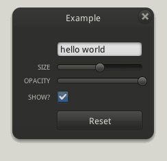 |
On the left is a Panel displaying several controls arranged in a Rows layout:
A custom visual style can be defined by setting nodebox.gui.theme to a Theme object. The default visual style is loosely based on the iPhone GUI. Due to time constraints we have yet to design a nice style of our own. Contributions in this area are welcome.
|
Theme
A Theme defines the source artwork for controls, and font settings for labels. A theme is loaded from a given folder path containing PNG images and TTF font files. The default theme is in nodebox/graphics/gui/theme/. Copy this folder and modify it to create a custom theme.
theme = Theme(path,
    fontname = "Droid Sans",
    fontsize = 10,
  fontweight = NORMAL,
        text = Color(1))
Control
The Control class is the base class from which all GUI controls inherit. All of its properties are available in each type of control. Since it inherits from Layer, it must be appended to the canvas (or another Control or Layout container) to receive events and get drawn. Each type of control implements a range of layer events (usually Layer.on_mouse_release()) to elicit the correct behavior when the user clicks or drags the control.
ctrl = Control(x=0, y=0, id=None, color=(1,1,1,1))
ctrl.id                                    # Unique name, e.g. "slider_speed".
ctrl.x                                     # Horizontal offset.
ctrl.y                                     # Vertical offset.
ctrl.width                                 # Control width (read-only).
ctrl.height                                # Control height (read-only).
ctrl.control                               # Control image color.
ctrl.enabled                               # True => receive events.
ctrl.reset() # Reverta to default settings.
ctrl.on_mouse_doubleclick(mouse)           # Double-click event.
cltr.on_action()
Label
A Label displays a text caption centered in the label's (width, height)-box. It does not receive any events. Optional parameters can include fill, font, fontsize, fontweight.
label = Label(caption, x=0, y=0, width=None, height=None, id=None)
label.caption # Caption text.
Button
A Button displays a clickable button that will fire Button.on_action() when clicked. The action handler can be defined in a subclass, or given as a function. This function takes a Button as its only parameter.
button = Button(caption="", action=None, x=0, y=0, width=125, id=None)
button.caption # Caption text.
Slider
A Slider displays draws a draggable slider that will fire Slider.on_action() when dragged. The slider's value can be retrieved with Slider.value.
slider = Slider(default=0.5, min=0.0, max=1.0, steps=100, x=0, y=0, width=125, id=None)
slider.min                                 # Slider minimum value.
slider.max                                 # Slider maximum value.
slider.default                             # Slider default value.
slider.value                               # Slider current value.
slider.relative                            # Slider value between 0.0-1.0.
slider.steps                               # Number of steps from min to max.
Knob
A Knob displays a twistable knob that fires Knob.on_action() when turned. The knob's value can be retrieved with Knob.value. With limit=True the value is constrained between 0-360 (i.e. knob angle).
knob = Knob(default=0, limit=True, x=0, y=0, id=None)
knob.default                               # Knob default value.
knob.value                                 # Knob current value (0-360).
knob.relative                              # Knob value between 0.0-1.0.
Checkbox
A Checkbox (or Flag) displays a checkbox that fires Checkbox.on_action() when toggled. Its value can be retrieved with Checkbox.value.
checkbox = Checkbox(default=False, x=0, y=0, id=None)
checkbox.default                           # Checkbox default value.
checkbox.value                             # Checkbox current value (True | False)
Field
A Field displays a single-line text input field that will fire Field.on_action() when ENTER is pressed. Text in the field can be modified and selected. The string value can be retrieved with Field.value. Optional parameters can include fill, font, fontsize, fontweight.
field = Field(value="", hint="", action=None, x=0, y=0, width=125, padding=5, id=None)
field.default                              # Default string value.
field.value                                # Current string value.
field.hint                                 # Display text when empty.
field.selection                            # A tuple of (i,j)-values.
field.selected                             # True => text is selected.
field.cursor                               # Index of caret position.
A multi-line field can be created with optional parameters wrap=True and height (field height in pixels). By default, ENTER and TAB keys are reserved. To add new lines and tabs in the field, use optional parameter reserved=[] (list of reserved keys).
Panel
A Panel acts as a container for other controls. It can be dragged when Panel.fixed=False. A control or Layout group can be added with Panel.append(). If the control is added directly (instead of in a Layout), its (x,y)-position needs to be set manually to create an orderly layout.
panel = Panel(caption="", fixed=False, modal=True, x=0, y=0, width=175, height=250)
panel.caption                              # Caption text.
panel.fixed                                # True => can be dragged.
panel.modal                                # True => has close button.
panel.controls                             # A list of Control objects.
panel.[control_id]                         # Yields control with given id.
panel.append(control)
panel.open()                               # Shows the panel.
panel.close()                              # Hides the panel.
panel.pack(padding=20) # Make panel as small as possible.
Dock
A Dock panel is attached to the edge of the canvas (LEFT or RIGHT), extending the full height. With fixed=False, it can be snapped from the edge and dragged as a normal panel.
dock = Dock(caption="", anchor=LEFT, fixed=True, modal=True, x=0, y=0, width=175, height=250)
dock.anchor                                # LEFT or RIGHT.
dock.snap                                  # Dock snap radius (by default, 1).
Layout
The Layout class is the base class for ordered groups of controls. A Control (or another Layout) can be added with Layout.append(). The layout will be applied when Layout.apply() is called. This happens automatically when the layout is appended to a Panel or another Layout. Note: in this case you can pass an optional spacing parameter to Panel.append() or Layout.append().
layout = Layout(controls=[], x=0, y=0)
layout.append(control)
layout.apply(spacing=10)
Rows
A Rows layout is a layout where each control appears on a new line. Each control has an associated text caption, displayed to the left of the control. The given width defines the desired width for all controls (the width of individual controls is ignored).
rows = Rows(controls=[], x=0, y=0, width=125)
rows.controls                              # A list of Control objects.
rows.captions                              # A list of Label objects.
rows.append(control, caption="")
rows.apply(spacing=10)
Row
A Row layout is a layout where each control appears in a new column. Each control has an associated text caption, displayed centrally on top of the control. The given width defines the desired width for all controls. The given align (CENTER | TOP) defines how controls are aligned vertically in the row.
row = Row(controls=[], x=0, y=0, width=125, align=CENTER)
row.controls                               # A list of Control objects.
row.captions                               # A list of Label objects.
row.append(control, caption="")
row.apply(spacing=10)
